I recent years when I first setted up my systems I always had the imense urge to immediately change the default light theme for the dark one instead, being on my computer or my phone. It became a second tought and I never stopped to think why I was doing this in the first place, but recently I came to the conclusion that this "obsession" was more related to pre-confabbed ideas rather than actual facts, and after some time I can see why.
When I was 10 years old I started to get clues of nearsightedness, mostly genetic-related, and due to that wearing glasses became a second nature early on in my life, after that I started to be a little more aware for preserving my vision and at the same time the whole idea of dark themes started to be more adopted by computer users.
I also got into this because it strained my vision way less compared to the light ones. Of course that it is proved that light and dark themes work better for different people and different goals, but it is funny that I've seen some "dark-mode users" out there completely hate any app that doesn't support a dark theme by default.
The thing is, there is a big difference between modern and classic light themes;
Nowadays you are bombarded with boring flat, washing all-white themes with no real contrast or depth, they without a doubt hurt the eyes of the ones with impaired vision like me.
However, in a lot of classic systems there are a greater use of multiple shades of gray and pale yellow, wich make for a much more pleasant experience using the interface, taking Windows 95 as an example, at the time there wasn't a huge separation between Light and Dark, what it had was instead a better use of color palletes and overall UI design, the same can be said about older versions of MacOS and even AmigaOS.
At some time I went full on this dark-mode principle, installing Dark Reader for having every webpage pitch black and searching for custom dark themes for all my apps, but then I realized that this a bit much overkill, nowadays I don't hate on light themes and instead I go for a "mixed" approach, using some applications in light theme and others in dark theme.
This website itself is using a light theme approach, if you had seen my first iteration of this site it would've been a mix of black, purple and yellow. A complete far-cry of what I set up after, being more of a Y2K style.
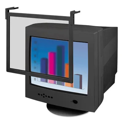
Another thing that really helped me is the Night Light feature, when I was a kid I remember that my family PC had a anti-blue\night light filter, wich at the time was literally a piece of dimmed acrylic that was put in front of the CRT monitor to reduce eyestrain, at the time I didn't even understand the motivation to be using that thing (I was a literal child), but I was at least lucky to have such considerate parents in that matter.

Zoomers these days don't even know what these are.
Anyways, instead of focusing way too much of my time on some random ramble here, I will keep these blog entries a little more condensed, basically just to serve as a way to pratice more writing and just throw some toughts in my free time as I did now.
But yeah, in short dark themes can suck too so don't be afraid of some light from time to time.
